Transitioning Customers To a Redesigned Product With No Increase In Customer Support Contacts

Year
2024
Company
Indeed
My role
UX Designer
Summary
In 2024, Indeed redesigned and rebranded its subscription-based resume database called “Resume” to "Smart Sourcing." I was responsible for designing the onboarding experience, to prevent an increase in Customer Support contacts and subscription churn. I led the team through mapping the Smart Sourcing onboarding journey, and used common UI patterns to improve the onboarding experience rather than relying on front-loaded instruction that is often ignored. 30 days after launch there was no statistically significant increase in Customer Support calls, saving CS an estimated 600 hours per week.
Introduction
Think about the last time you tried a new digital product and realized you would never do things the same way again. When I first tried Reclaim AI, a Google Calendar scheduling plug-in, and realized I would never have to spend time meticulously checking schedules to rebook a meeting that had been double-booked, I became a customer for life.
Unfortunately, many customers are drawn to exciting new products only to be deterred by poor onboarding experiences. As a result, they struggle to grasp immediate or long-term value, ultimately leading to churn.
Project Background
Indeed is the #1 job site in the world, with over 350M+ unique visitors every month. The employer-facing side of Indeed generates most of the company’s revenue. Employers can post and sponsor jobs on Indeed, and purchase a subscription to Indeed’s “Resume” product, where you can search a database of over 295 million jobseekers' resumes.
In early 2024 Indeed was preparing to replace "Resume", with a new product to be called "Smart Sourcing”.
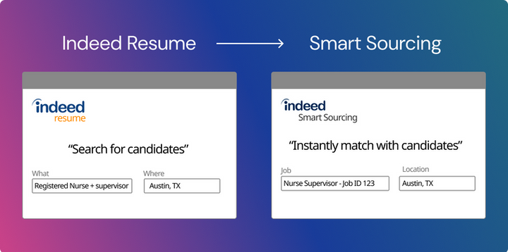
Smart Sourcing aimed to simplify the search process by presenting a list of candidates whose qualifications matched a recruiter's job description for Indeed-posted jobs, complemented by AI-powered features. There was also a significant price increase.

The problem
Smart Sourcing was piloted with several customer groups, and data indicated this new product was leading to 20% faster hires, and candidates were 17-time more likely to apply when invited to a job.
However, all of the users in these pilot groups had undergone formal training from Indeed Customer Success (CS) Implementation specialists on how to use the product. None of them had just been dropped into the product and figured it out on their own.
I had to figure out how to onboard new and existing Indeed customers to key features in Smart Sourcing so that they would quickly see value in a product that changed how they work and was now costing them more money.
The goal
The team's goal was to introduce this product change without increasing customer support contacts.
My team
I was the lead UX Designer on the The “Onboarding & Activation” team. My UX research partner was not available to support this work, so any research would need to be done by me.

I also led meetings with a cross-functional team comprised of Marketing, CS, and other parties who had a stake in Smart Sourcing's success.

The timeline
I was given six weeks to design an onboarding experience for Smart Sourcing.

Mapping the onboarding journey
I facilitated a workshop with the Smart Sourcing collaboration partners to map out the Smart Sourcing onboarding journey. I follow five steps to map onboarding journeys:
Step 1: Defining the end state of Smart Sourcing onboarding
Step 2: Define why a user came to Smart Sourcing
Step 3: Identify what the most successful Resume and Smart Sourcing customers do
Step 4: Identify which behaviors deliver early value
Step 5: Prioritize the behaviors that need onboarding to ensure long-term success

I convinced our team to prioritize features that were most foundational and delivered value early on, to those that have more value over time.

Preparing users for a major product change
I designed several promotional announcements to start notifying users of the upcoming shift from Resume to Smart Sourcing. This required coordinating with Legal, Marketing, and several Content Designers.


A promo card on Employer Home alerting users to the upcoming product change.


A promo card on the Resume Landing page alerting users to the upcoming product change.
I also designed several screens for post-launch to help users understand the change.


A "new" tag in the global side navigation signaled to users there had been a change, and left a clear information scent on where they could learn more.


An updated card on the Smart Sourcing landing page explains the change in name and functionality.
Onboarding users to Smart Sourcing key tasks
Now that users were aware of the change, it was time to make sure both new and existing users were able to adopt our four identified key tasks from the onboarding mapping exercise:
-
View matches or complete a search
-
Using AI Message generation
-
Creating a template
-
Sharing a candidate with their hiring team
Often companies will use a solution like a modal where they tell a user all of the things they need to know up front, like this:

A conceptual design of what front-loaded instruction for Smart Sourcing might look like.
Research has shown that front-loaded instruction is often ignored by users, who would rather learn by doing. Instead, I recommend using an approach called guided interaction, which is the breaking down and contextual incorporation of onboarding content into a product’s core design. Here's how I applied guided interaction to Smart Sourcing onboarding:
Key Task #1 : View matches or complete a search
In Smart Sourcing, users can view a short list of applicants who meet the requirements for the Job, or they can search for jobseekers using keywords and location. In my heuristic evaluation of the Smart Sourcing landing page, it wasn't clear that matching and searching were both now possible, or which fields were optional or required. Customer Success Implementation reps confirmed this issue during pilot studies.
Instead of relying on modals, popovers, or tooltips, I fixed the core design of the page. Changes in the proximity of the matching and searching fields, editing microcopy, and adding a divider line to clarify is all it took. No fancy onboarding patterns needed.
Before

The initial landing page for Smart Sourcing — it is unclear which fields are required, or if all are optional.
After

I used a divider line and micro-copy "or" to separate the Search fields, from a link that prompted users to log in so that they could use posted jobs to view their matches.
Key Task #2 : Using AI message Generation
Smart Sourcing added AI messaging for employer-candidate communication. CS told me that during the pilot users hesitated to try the feature due to uncertainty about AI's ability to write personable messages.
To address these concerns I recommended adding sub-text to explain how the feature works, using an example of an AI message as placeholder text, and tweaking the title of the feature to "Message with AI assistance to call out that it helps the user with messaging, it does not replace the user completely.
Before

The string "Message with AI assist" sounded like a noun rather than an action. There was also no explanation of how it worked or what the result would be if the user clicked the "Generate a message" CTA. The CTA was also out of order in hierarchy, appearing after the input field, instead of above. where a user would see it before starting to write. The CTA was also visually overwhelming as it used a gradient for a background; the product team insisted on keeping it to highlight Indeed's usage of AI technology.
After

I suggested changing "Message with AI assist" to "Message with AI assistance" to emphasize user support. I moved the CTA above the input field for a smoother form flow. The button style now features a white background with a gradient border, maintaining the desired gradient effect while reducing visual clutter. Additionally, I included placeholder text showing a sample AI-generated message for user preview.
Key task 3: Saving and using templates
The Contact Form emphasized template creation, diverting attention from immediate messaging tasks.
I recommended moving template fields to the bottom for familiarity and to reduce cognitive load. Also, I suggested auto-populating the template name with the job title of the role the user was including in their message, and making "save as template" the default option to encourage template creation.
The design forced the user to come up with a name for their template which would slow them down. Saving a template was also not a default option, the user was unlikely to change this default setting.
Before
After
I changed the design to have saving a template as a default option, and populating the template name with the job title of the role the user was messaging a jobseeker about.
Key task 4: Sharing candidates with your team
After a user sends a message, the confirmation screen prompts the user to add a candidate to a Project folder. Projects are Indeed's way of saving, organizing, and sharing candidates within a hiring team. The current text did not explain the value of Projects nor did it nudge the user to share a candidate.
I added messaging within the confirmation modal to explain the value of the feature and nudge the user to share the candidate with their hiring team.
Before

No context is given on what a "project folder", which is how a user can share candidates with their hiring team.
After

I added a small box with text explaining that a user can share candidates with their hiring team, and then gave more context about Projects including a CTA to start the process.
Value delivered
Initially, the team planned to implement all onboarding phases for launch but only launched with initial changes I had made for our first core task - ensuring matching and searching could be complated. Other tasks would follow post-launch.
30 days post-launch later, there was no increase in customer support calls for Smart Sourcing compared to the previous six months for Resume support calls. CS estimated preventing at least 600 hours of support calls per week, even with a 10% increase in Smart Sourcing support calls.
Retro
A few things I would change if I had the chance to do this again:
-
I would have planned for more time to do some usability testing on my onboarding designs. Though my team and feedback group agreed my improvements were worth launching based on CS feedback, I would have loved to see them tested. Unfortunately, time and resource constraints made that difficult to happen.
-
I would have had the initial Smart Sourcing designs tested with new users. They were only tested with existing users and with guidance from Indeed CS. Had we tested with completely new users, I think we would have caught some of the misses in the designs earlier on.
Given that I did most of this work on my own in just a few weeks, I'm very proud of this work as I was able to influence a major product launch at Indeed by gaining the trust of the cross-disciplinary team by involving them in the whole process.
I also became known as the onboarding SME at Indeed after this and received many requests from other teams to support their work.